I love this blog and am always re-thinking it, re-considering it. In recent months, I’ve come to see that the blog is not replacing books, but is becoming a kind of book all of it’s own, a living memoir, hopefully and possibly my great work. Inspired by Steve Jobs and others, the designers at Mannix Marketing and I have been working to streamline the blog, make it colorful, simple, visual.
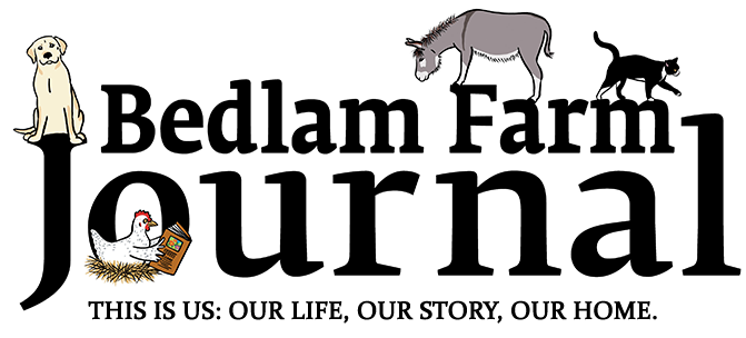
Recently I asked the designers at Mannix to help me try and connect the blog more to the word, more to the idea of a book. We have been batting designs back and forth and this is the latest version of the new header, version 2.0. I thought you might want to see it. This one doesn’t quite work for me, the type face is too large and loud, it looks too much like a newspaper headline, it just comes on too strong. My idea (feel free to post yours on Facebook) is to make the typeface smaller and cooler. My notion is to take quotes from the blog, from the writing, and present them in this header as fade-ins (I got this idea – actually the fade-in was Maria’s idea – from the neat way the writers in “The Great Gatsby” wove the text in and out of the movie).
I want to emphasize the words on the blog as well as the images, to evoke literary typeface and text as well as Net color and visual design. As always, I share as much of the process as you can. This is not the final design, but I thought the readers of the blog should get a look at it. I’ll look forward to reading your comments on my Facebook Home Page. Let me know if you like the overall idea. Eventually there would be different quotes from the blog either streaming across or fading in and out, my preference. Give words the respect they deserve, and invoke the idea of the book.

