Wanted advice is different, I find, than unwanted advice. It is much better. This is a big round for interactivity. Since I posted the evolving versions of my new header, I’ve gotten hundreds of comments from blog and book readers, the vast majority of them interesting, useful and helpful. They have helped affirm, crystallize and change many of my original ideas about this project.
I have to be honest, the vast majority of comments are right in sync with me and Mannix’s designers. We have all liked each version better than the previous one, although there is a wide range of divergent opinion about things like colors and spacing. The Times Roman type face is a big and nearly unanimous hit. At first, the Mannix designers were wary, even stung by some of the criticisms, but one of the beautiful things about interactivity is that it is helpful. You bring your community into the process rather than exclude, surprise and frustrate them. As we read your comments, the designers and I gained strength and clarity also, even when we went a different way.
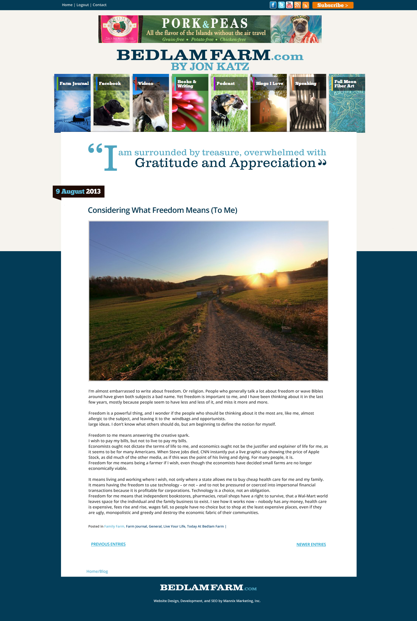
Readers overwhelming loved the idea of using quotes in the header to connect the blog with the idea of the book. Some thought the quotes out to be readers comments from Facebook and other social media. I disagree there, interactivity has it’s limits, this is still my blog, my voice, it is still a monologue, not a dialogue. Comments are welcome on Facebook and elsewhere, I read as much e-mail as I can, but I need to preserve as much space in my head as I can so I can write well and take photos. I can’t be interacting all day, Facebook is a disease as well as a powerful communications tool and I am careful and disciplined about how much time I spent there.
So I think this version is very close and thanks for your input. I’m still mulling whether there should be lines above and below the quote to separate it from the Farm Journal. I’m not sure, it floats out there cleanly and well. We decided to put quotes on it, the colors can change, I like the quotes broken up into different type sizes and faces, it is a modern, graphically arresting kind of look. I think the quotes fading in and out will give the blog a living look, much like the Internet around it. Unlike paper books, this one has color and can move, show videos, present podcasts. It should look like a book, but a new kind of book.
This version, 5.1, is pretty close to the mark. I like it. It will connect my blog to words as well as images, to my history, to my themes and words. And it will be colorful and move. I appreciate those of you who are commenting on it, it has been more helpful than you know, and I much enjoy working with Mannix, they have been at my side ever since I began the blog and always come through. So have you, the people reading it faithfully. The blog is my great work, I love it more and more each day.