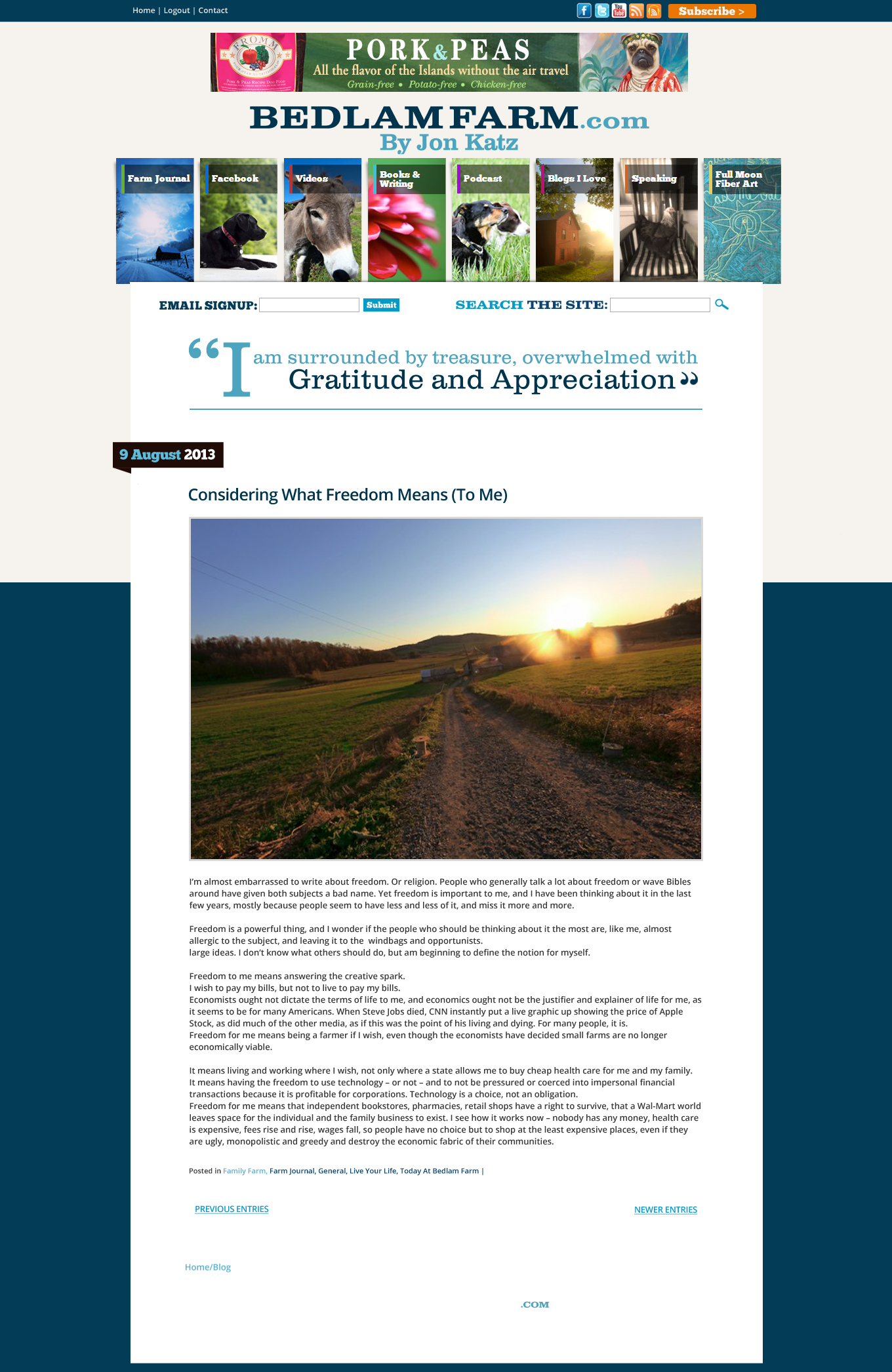
This is the sixth, and I think, final design for the new header for bedlamfarm.com, designed to connect the blog more to my words and the idea of a new kind of book. Mannix designers have done a great job of taking my vision and translating into something that works for my blog, not an easy thing to do, this has not been done all that much before.
I want the blog to come alive, to have vibrant and moving parts, like a new kind of book.
The goal is choose a score of more of my quotes – those that capture the themes I write about – and fade them in and out at the top of the page. They can be changed or added to over time. We wondered about a line to separate the quotes from the Farm Journal and that is helpful, that works for me. I love the Times Roman type face, it is graceful and literary. The only issue that remains for me is the color, I think the soft blue is too weak up there, I’m thinking of something stronger, a deep red perhaps, let me know what you think.
Your comments have been valuable, wanted advice is so much better than unwanted advice. I appreciate them, take a look at this final design, except for the color, I think we have it. I loved sharing this with you, a great way to start and develop this new kind of book.

