Graphic Designer Sara Kelly sent over the first proofs of the Army Of Good Bumper Stickers I’m hoping to sell and distribute them to the very good people who have joined me on this great adventure. Our way of spreading the word and even spotting one another in unexpected places.
The cost will be high enough that I will have to charge for the bumper sticker, this is America, and nothing is as cheap as we expect
I’ve decided to sell them only on Maria’s Etsy site and through my Post Office box. No Paypal or e-mail, it will be too difficult to separate them from the regular donations.
I am determined to keep the cost as low as possible, but I might charge enough so that they can be a donation to our work, which is fitting, something like $10. Any money above the production costs – the design, stickers and new envelopes – would go to the Gus Fund for the refugees and Mansion residents.
Please do not try to order them yet, they have not been chosen and I can’t save orders or take pre-orders. I can’t be responsible for any orders that come in before they go on sale, if we get that far, thanks. I am drowning in e-mail messages.
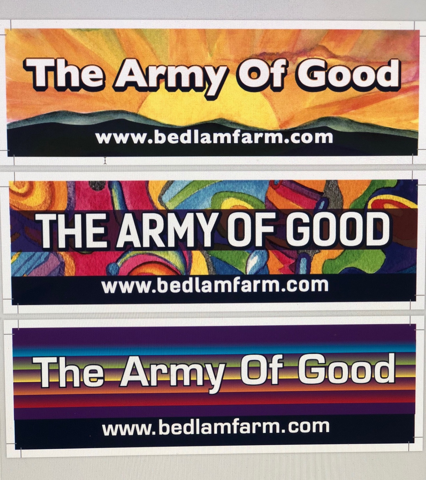
These are the first three designs, not the last.
Of the tree, I discarded the middle one immediately – too much like a stained glass church window, and am drawn to the first. I like the idea of the sunrise, I think it reflects the spirit and energy of the AOG, but I asked Sara to try a design without the mountains. They seem a bit hokey to me. No. 3 doesn’t really work for me, but see what you think.
I like the font of No. 2. I asked Sara if she could keep the sun and get rid of the rays in No. 1. I’m a Steve Jobs follower, simple is always better. I don’t want the bumper sticker to look like a New Mexico license plate. I do think the sun is a neat idea, and colorful, it would be seen.
Maria likes No.1 with the mountains, but also without it. (I really think we need fewer rays), she went to it right away.
I would be interested in hearing what you think, either by posting on my blog below, or e-mailing me at [email protected] or by posting on my Facebook page, where this post will appear. You people have to like the bumper stickers, and you have earned a say.
I’m calling the top No. 1, the middle No. 2, and the bottom No. 3.
I’d like them to be fairly large, not tiny, but not too conspicuous either.
#1. Maybe less rays…the simpler the better…
Hi Jon
I think I would prefer #2. #1 is OK too…………..#3 looks too rigid and stiff for my taste…….. I think it should be colorful and visually inspiring and #2 does that for me!~
For what it’s worth LOL!
Susan M
I like #2 the best, because it’s bold, purposeful, and yet a joyful jumble of colors.
I like #1 the next, though it is softer in it’s design. Hopeful and aspirational.
I would discard #3, because it looks similar to the gay pride flag, a very powerful symbol already in use.
I agree with you sun without rays is simple and hopeful. Good luck finding just the right design.
A great idea, and I am glad you are going with it. I like the middle one. Very stained glass-ish, and modern at the same time.
#1 with less rays, or muted a bit. The other two I find look too southwestern, which is not a bad thing, but the colors are just not right in my mind.
First one for sure!!!
I vote for number one.
I like #2 the best. I like the rainbow colors and the swirls
I was immediately drawn to number one. The sun rising seems just the right symbol for the Army of Good. Also like the #1 font, as it is easier to read when there is both upper and lower case. But #2 font would be my second pick. I am pretty neutral about the mountains – their darkness is a great background to the Bedlam Farm site address.
I like the second one. Kind of a Gee’s Bend look. Do not like the third one. Maybe Ed could make the decision and we’d all accept that.
Having run about 50 political campaigns, my suggestion is that whichever background you choose, you need to make “The Army of Good” bigger. That is your message and it should be the main focus. Remember people are seeing these mostly on moving vehicles and only a glance.
I Love number 1, rays, mountains, and all. To me it symbolizes the dawning of a new day, with people who care about other people.
I prefer #2. Agree that you need to make type BIG. Prefer all caps but if u&lc please don’t capitalize “of”. What if color background was camouflage pattern, but colors? Like Army of Good would wear? Oh, you don’t need www in your URL.
I like #2. It’s evocative of the photos that you take. 🙂
#1. Easiest to read on a moving vehicle. But perhaps the font should be bigger or more legible so that it is easier to read at a glance.
No. 1, and I like the mountains. All of the people connected to/by the AOG have faced peaks and valleys. And have learned to conquer mountains; it is molehills we trip over.
Hi Mr. Katz,
could you make one smaller that would fit on the rear window of an SUV?
Maybe later, Lisa, not now…
#2 is my choice, bright and eye catching it immediately draw my eyes to it over the other two
How about No. 1 (I like the sun idea…a new day) but with more color to it to bring the eye in?
#1, and the black shading behind the letters has them stand out. Like the initial caps with small letters. The colors of the others interfere with the lettering.